
The importance of mobile optimisation for your website can’t be overestimated. Google are currently re-organising the entire database and from next year websites that are not mobile optimised won’t even rank on the search engine. We have no definitive date for doomsday but it is on its way. So why has is this happening? Read on to find out more.
Smartphone passes out desktop
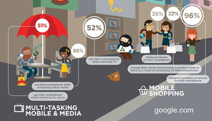
The smartphone has become revolutionary, they have evolved dramatically, shrinking in size and expanding in features. Smartphones are no longer only used for calls, they are mini computers that have now passed out desktops and PCs. They have become part of us, attached to our bodies like an arm or a leg. They are with us when we’re out and about, when we eat, when we sleep, when we watch TV – and you’re probably reading this on a smartphone right now. Even granny and gramps are caught browsing the web on their phone – poking and tapping the screen with their index finger. Adults on average spend 2.5 hours each day on their phone and it’s not surprising that by 2018, one-third of people around the globe will own a smartphone (or two).

Consumer Behaviour has changed
This rapid increase in smartphones has impacted consumer behaviour. Customers are often on the go, stuck for time and using search engines like Google, Bing, and Yandex to look for quick answers. There are many scenarios throughout the day where you simply reach into the pocket for your mobile Ephone and search for a product or service that you need instantly. Example 1; You’re in town and remember your dodgy light at home, you quickly search Google and are hit with electricians in your area, you click on the available number and bam that’s sorted for later. Example 2; You realise in work that you forgot your friend’s birthday and you don’t want to look like a terrible friend, so you quickly tap onto your phone and order something nice online that will be delivered tomorrow – PHEW. These micro-moments where people automatically turn to their smartphone or multiple mobile devices, to act on a query, or even ask for advice, demonstrate how powerful mobile devices have become. Mobile rules the world.
What does this mean for your business?
Everyone is on a mobile device, which means businesses must think mobile. 80% of consumers search on mobile devices irrespective of time or location. So, whether you want to improve visibility of your brand, increase your website traffic, or increase sales and revenue, you must ensure your website is optimised for mobile. An optimised website is the ultimate way to gain a competitive edge whilst keep your customers satisfied. After all we all know that a happy customer is a loyal customer.

Mobile optimise to keep Google happy
Google has recognised the importance of mobile-optimized websites since 2015 when the tech giant made changes to its algorithm, highlighting mobile optimised websites as a ranking factor in SERP (Search engine results page). Google’s bots try to return pages that are mobile friendly and optimised to prevent people getting pages which are frustrating to navigate through. We have all stumbled across a page where you must pinch and turn the phone to view the website, and end up closing the page straight away. We encountered a government site which required us to fill in a form recently. It was practically impossible to fill out the form via a mobile phone. We had to wait until we were back at the desktop device to complete the form. This wasted a lot of our time and caused a lot of resentment. There is no need for it in this day and age. In a private company, the situation would not favour well with either Google, or your customers and will end up costing you money.
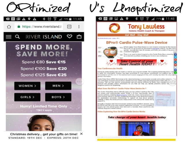
What is a mobile optimised website anyway?
Mobile optimisation can be done by creating a responsive website (where it will ‘respond’ to any device to is viewed on by adjusting different parts of the website to suit a mobile, a dynamic website (where the screen size adjusts depending on the device) or a separate mobile website (which is completely different to the desktop website). Whatever one you choose the most important factors according to Google are performance and usability. Considering the goal orientated tasks and demands for quick responses from consumers means the mobile website needs to align to meet consumers needs. For example, an optimised website would have quick page load times and easy navigation. Content would be easily read, and information would be presented in easily digestible bites to help the consumer reach their goal. Most importantly fat finger syndrome would be avoided with correctly sized images and buttons for mobile device use.
However, managing two separate sites or trying to get your responsive desktop website to work well on mobile browsers can be a challenging task and if not done right your SEO ranking could be affected. At The Business Fairy, we have developed a software that allows you to manage both your desktop website and your mobile website from the same online location. Contact us for more information, we would be happy to help.