
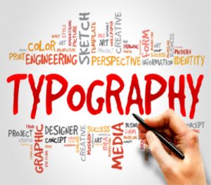
Importance of Typography in Advertising
Typography refers to the art of arranging type. By using decisive typography you can create interest within your advert, as well as making the advert reading aspect effortless. This is a great way to grab readers attention making them more likely to read your advert, and hopefully purchase from your company, or recommend you.
When it comes to branding your business through advertising, typography is an important tool. Choosing the wrong font can give the wrong message, whereas choosing the right font can really drive the message home. Choosing the right words to use to get your message can sometimes be hard, words are powerful and depending on the design you use, as well as the type font can result in how the reader comprehends the information. You need to make sure your adverts are readable, the design and visual aspect of art also need to appeal to your brand.Imagine using comic sans on a the Ministry of Health advert for example, it just wouldn’t work. The message wouldn’t be taken seriously.
When you are trying to make your advert a success you need to make sure you are using the correct font, point size, colour, and letter spacing. All these small details can be the difference between your advert being a success or being a failure. The famous graphic designer Paula Scher is the master at this. She is famous for her designs using fonts and paints with words, and has developed the visual language of iconic brands and institutions around the world using fonts.

Text Sizing
Choosing the correct font size can play a part in your advert being noticed or not. Using a large font, for example, tends to stand out and attract readers, where a small font may come across as being cramped and squished together that it doesn’t appeal to readers. This is something we, as a digital marketing agency, have to stay focused on. However you can mix the same font type with a larger heading and then smaller emboldened version underneath, which helps to keep the reader’s attention, essential when trying to drive a brand message. Paula Scher completely re-invented the identity of the Public Theatre through her use of fonts in the mid 1990’s. She fused both high and low fonts together to create a new symbology for the theatre that continues to this day, making their brand instantly recognisable.
Font choices
Choosing the right font to attract your readers is important. If you use fancy fonts such as Lobster, Impact, Pacifico, Caveat these texts can distract readers compared us using fonts such as Arial, Comfortaa, Lora, or even Times New Roman which are more simple letters to read. Using a simple font makes it more likely that your advert will be read.

Mixing Colours
Using a mix of colour within text content can add drama, emotion, and personality to the word that is printed. Having a keyword in a different colour can make the advert more visually appealing. Using a colour to highlight a word or phrase can be just as powerful as using bold text. Don’t overdo it on the colour as too much colour can be distracting to the readers. Remember the rule ‘just because you can doesn’t mean you should’.
Hierarchy
Hierarchy helps the advert stay easily noticeable, allowing readers to take in the information from the advert quickly. This helps organise and rank what information is given. By arranging the headlines, sub headlines and the body of the ad in different font sizes will help make it stand out. See the example below, used by Coca Cola. They have also mixed fonts here which helps make the message more easily legible.

Emphasis
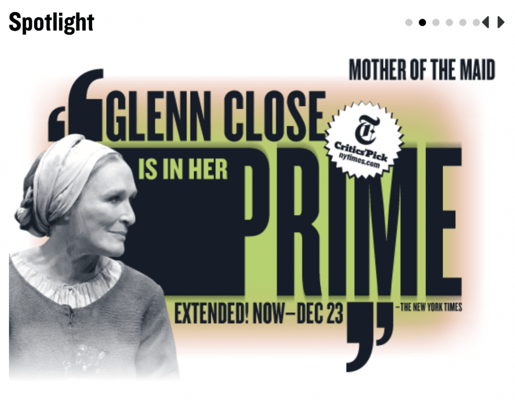
Just like hierarchy, emphasis helps the reader be able to scan for the important information within the advert. Using CAPS, bold text, italics and underlined text can help you drive the advert to the right audience. But just like using to much-colored text in the ad, using too many CAPS, bold, italics or underlined can lead to the reader losing interest in the advert. Less is more. See the Atlantic Theatre example below where all the same font type is used but the colours are used to draw your attention to the main message.

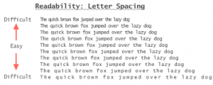
Spacing of Letters
For the advert to have a readable aspect letter spacing is an essential tool to use. If your text in the advert is too close together it will make it harder to read, whereas if the spacing is too large between, it then becomes difficult to read. The reading aspect of the advert should be effortless to make it possible for more audience to see and interact with the ad.
We hope that by sharing our experiences and lessons we’ve learned along the way here at TBF, these tips on typography will help you in making sure your brand will receive the best interaction and reaction possible.